Button Links
Button Links are normal links that have been styled to look and behave like buttons. This can be handy if you want to draw attention to a specific link, or treat it as an actionable item on the page. Use buttons for calls to action that guide your visitors to engage with the content you want.
Styles and Examples
All of the button styles come in three different size variants: Small (sm), Regular, and Large (lg). The sizes are indicated in parenthesis after the button style names; if no size is noted, it should be assumed as the Regular size for that particular button style.
WKU Red Button
This style will display links as a red button with white text. This button style is useful as primary action buttons, note content of higher importance, or to simply draw attention to something. When hovered over, the button's background color changes to a slighlty darker red.
Gray Button
This style will display links as a white button with gray text and border. This button style is usually used to indicate something of normal importance, or lesser importance than something using the WKU Red Button style. When hovered over, the button's background color changes to a WKU red color, and the text color becomes white.
WKU Red Outline Button
This style will display links as a white button with WKU red text and border, similar to the Gray Button style. This button style is useful in helping your button links stand out just a bit more than the typical Gray Button style. When hovered over, the button's background color changes to a WKU red color, an the text color becomes white.
Overlay Outline Button
This style will display links as a semi-transparent button with white text. This button style is intended to be used with STYLE-3 of the Card Snippets, where content is overlayed over an image. When hovered over, the button text becomes a light gray color.

Alert Button Link Styles
Edit Link Method
Please Note: The Button Link component is now the preferred method to create a button style. Learn how to add buttons using the Button Link Component.
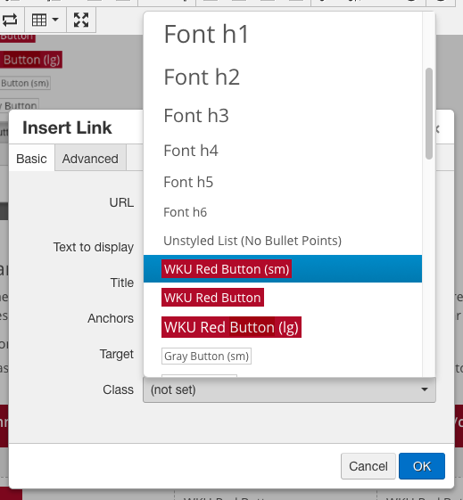
Link styles are applied using the Insert/Edit Link dialog, not from the Styles dropdown in the toolbar. Applying a button style to a link using the Styles dropdown will produce undesried results.
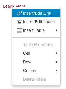
Open the the Insert/Edit Link dialog by either right-clicking on an existing link and choosing Insert/Edit Link from the pop-up menu, or highlighting the text you'd like to make into a Link Button and clicking the Insert/Edit Link button ( ) from the toolbar.


From the Insert/Edit Link dialog, select a Button style class from the Class dropdown list. When you have one selected, click OK. Examples of each style are shown below.

Block Display Buttons
By default buttons are as wide as the text that you put inside of them. However, in some cases you might want your button to fill the width of the container it is inside (Ex. inside a card snippet, column snippet, or in a side column). To make a button change it's display setting there are some extra steps involved.
Do not use this button style in the main content area. Reserve wider buttons for smaller content areas like cards, columns, or side column content areas.
After creating your button and hitting OK in the create link dialog:
- Right click your button and select Insert/Edit Link (or click within your button then hit the icon in the toolbar)
- Change the Class dropdown from the button to "(Custom)", this shows a text input underneath with the button classes
- Add as space after the existing btn- classes, then the class "btn-block". Do not remove any of the btn or btn- classes that are placed in automatically.
- Click OK and your button will change to be full width.
Need Assistance?
The WKU ITS Service Desk is here to help. Give us a call, chat with a representative online, use the Self-Help Knowledge Base and more.

