Headings
Headings communicate the organization of the content on the page. Web browsers, plug-ins, and assistive technologies use them to provide in-page navigation. Headings are also used by Search Engines. Using them incorrectly can negatively impact Search Engine Optimization (SEO) and Accessibility.
Nesting and Order
Headings are considered ranked content. Each heading can have a rank between 1 and 6. The most important, top-ranked heading level is heading 1 (H1). This heading level should be reserved for things like your page title, which is automatically added for you via Page Properties.
Following heading level 1 (i.e., your Page Title), only heading levels 2 through 6 should be used in a consecutive and nested fashion. The selected heading level for each consecutive heading should either match the previous heading level, decrease the heading level by one, or jump to a higher heading level (which does not have to be consecutive).
The best way to think of headings is to think of your page as an outline, where the content of your page is split into sections and related sub-sections, etc. Headings define those sections and how the various levels of headings define how they related to one another. For example, using a heading of level 2 would be the equivalent of defining a new main item of your page outline, while a following heading of level 3 would be considered a sub-item of the previous heading level, showing that the new content is related but also stands on its own. This concept is demonstrated further, visually by our Page Structure example.
Ex. A section titled "Cars" would be heading level 2 and have sub sections "Make" and "Model" with heading level 3.
H1 Page Title
H2 Section
H3 Sub Section
H2 Section
H3 Sub Section
H4 Sub-Sub Section
H5 Sub-Sub-Sub Section
H3 Sub Section
H4 Sub-Sub Section
H2 Section
H3 Sub Section
H3 Sub Section
H1 Food
H2 Breakfast
H3 Biscuits
H2 Lunch
H3 Sandwiches
H4 Hamburgers
H5 Cheeseburger
H3 Salad
H4 Cobb Salad
H2 Dinner
H3 Pasta
H3 Rolls
An Example Page Structure
This example is for visualization purposes only. Headings and sub sections are not
tabbed or spaced over.
Styles
To differentiate between levels of headings you can add colors or italics to your headings. An easy way to maintain a hierarchy is to alternate between a default style and colors/italics when changing between levels of headings.
You can also use the Advanced Text Styles to change the size of your headings. Use the Font h1 - Font h6 styles to change the size of your text to another heading's size. By changing the size of your headers in this manner, it allows you to customize their look and feel without compromising the underlying, proper heading level for accessibility and SEO purposes.
Please use these stylistic changes with care. For example, it is not recommend that a nested header's size be increased to match a higher ranked heading level, however, changing a nested header's size to match a lower ranked heading level is typically okay. Changing the header's size disproportionally to the surrounding headers and their heading levels could cause visitors of your page to be confused in understanding how each section of your page relates to others.
As an example, this web CMS example site uses the WKU Red Text style on headings of level 2, no style changes to headings of level 3, and the Semi-Bold Text and Font h5 styles on headings of level 4. This can be altered or combined with any other styles to create a unique hierarchy on a page.
Secondary Heading Text or Subtitles
In cases where your title may be very long, or you simply need to convey an extra message inside a header, use Advanced Text Styles to give part of your header a smaller sub-heading appearance. Combine the Smaller Text and color styles to differentiate between main and sub heading text.
Locating Headings
Use the following tools and guides to assist in identifying headings and their levels
on a page.
Show Blocks
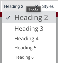
When working in the WYSIWYG editor each new line uses what is called a "block" item. Blocks are selected using the Blocks dropdown (see Blocks Dropdown, below) from the WYSIWYG toolbar. The most common blocks are Paragraph and Heading 1 - 6.
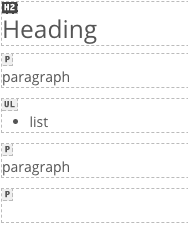
When fixing accessibility issues identified in the Final Check it can be difficult to know what block is being used. To reveal those blocks, use the ![]() Show Blocks button in the WYSIWYG toolbar (the dotted box around a paragraph icon). This will
add a thin dotted border around every block and a small tag identifying which kind
of block it is.
Show Blocks button in the WYSIWYG toolbar (the dotted box around a paragraph icon). This will
add a thin dotted border around every block and a small tag identifying which kind
of block it is.
To highlight blocks, use the Show Blocks button in the WYSIWYG toolbar (the dotted box around a paragraph icon). This will add a thin border around every block and small tag identifying which block it is. Headings are marked H1 - H6 and have a dark background.


Blocks Dropdown
The blocks dropdown controls the block item, this includes heading levels. Click inside the text of a heading and the blocks dropdown will update to reflect that block level. To adjust the type of block being used, click inside the text of a heading or other content area and then select a new type from the Blocks dropdown.
Content Area Order
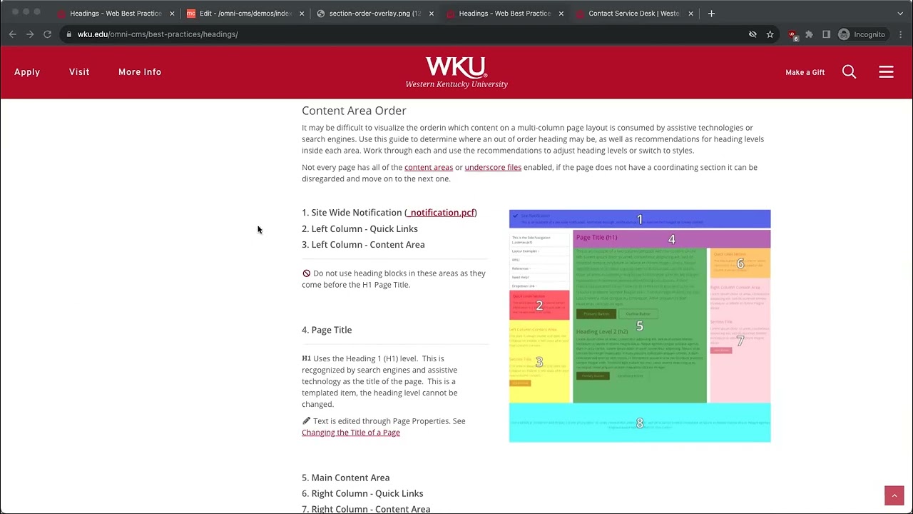
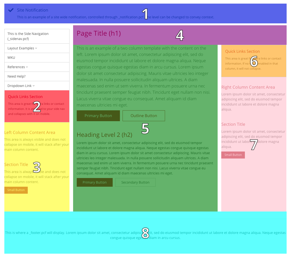
It may be difficult to visualize the orderin which content on a multi-column page layout is consumed by assistive technologies or search engines. Use this guide to determine where an out of order heading may be, as well as recommendations for heading levels inside each area. Work through each and use the recommendations to adjust heading levels or switch to styles.
Not every page has all of the content areas or underscore files enabled, if the page does not have a coordinating section it can be disregarded and move on to the next one.
1. Site Wide Notification (_notification.pcf)
2. Left Column - Quick Links
3. Left Column - Content Area
Do not use heading blocks in these areas as they come before the H1 Page Title.
4. Page Title
Uses the Heading 1 (H1) level. This is recgognized by search engines and assistive technology as the title of the page. This is a templated item, the heading level cannot be changed.
Text is edited through Page Properties. See Changing the Title of a Page
5. Main Content Area
6. Right Column - Quick Links
7. Right Column - Content Area
Use Headings Level 2 and below (H2 - H6) nested properly.
Do not skip heading levels or use out of order.
8. Site Footer (_footer.pcf)
Use Heading Level 2 only.
Do not use headings below level 2 (H3 - H6).
Need Assistance?
The WKU ITS Service Desk is here to help. Give us a call, chat with a representative online, use the Self-Help Knowledge Base and more.


